Circle is a private residence designed by Ganna Design.
It is located in Taoyuan, Taiwan.


Circle by Ganna Design:
“Background of the Residents
The host is a …in finance industry and the hostess is a retired teacher. They have daughters who are officers now. This family has lived in a three-floor townhouse. However, considering the long commute between Taoyuan and Taipei, the parents decided to buy a house in Taipei for their daughters. Except for the convenience, the parent can visit their two daughters in the weekends.
Original House Situation
There are 4 rooms, 3 bathrooms, 1 living room and 1 kitchen in the original layout. The kitchen and the bathroom are all complete construction. Hence, the position of bathrooms and the kitchen are remain unchanged, and also without design.
Clients’ Attitude toward Life
The first house own by this thrifty couple is located in Taoyuan, which has larger acreage and with traditional decoration. Restaurant, cupboard are randomly covered with simple tiles, rooms with simple cabinets; material adoption and space do not relate to each other. So do color choice and decoration. Except for enough storage spaces, the house owners didn’t have any idea about the house in the discussion. Therefore, the designers try to design in a way of simplicity and elegance in order to harmony with the owners’ personalities.
Design Concept of this project
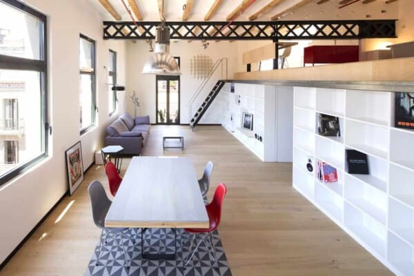
The designer introduces the bench into the house. The bench elongates from the door to elevated area. Black object is shoes cabinet. The slope guides visitors into the living room. The designers tear down the wall of one room, and exchange the place of living area and study room (elevated platform now). Therefore, the users can make the best of use the view and natural illumination, have a coffee or chat together in the elevated area.
Next to the elevated area is the living room. The designers use marble wall to partition living room and dining area. Marble itself can present the beauty of purify even without any process.。Furthermore, except for the space for DVD player, there is no other decorations on this main wall in avoid distracting the users from watching television. The width of the TV wall is would not block the view and natural illumination from outside.
The second main wall is the glass cabinet. The function of storage and display is required, so the designers need to figure out a way to combine them together. Then, an idea comes up with the designers’ mind that different glasses can satisfy this requirement. Frosted glass can remove clutter visual feeling, and clear glass is inductive to display collection. On the other hand, sapphire pendent light and round dining table were chose in order to soften the stiffer visual effect brought by rectangular glass cabinet. Also, round table is easy to move, increasing the flexibility of mobility.
Regarding to the lighting, instead of using embedded light, the designer uses wall fitting light to make the aisle looks like a lateral in art gallery. The residents in the house can, hence, live in simple but elegant environment.
Concept of Interior Spatial Arrangement
The designers started from the study room, which was the first room close to the living room. At first, the house owner hoped to maintain this room and make it is as a guest simultaneously. However, the designers found that size of this room could accommodate only one people. Needless to say this room would keep other rooms from enjoying the view and sunlight. That’s pity. Therefore, the designers discussed with the house owners and tried to figure out a way to combine living room, study room and restaurant together. Besides, to make the traffic line circle, to make the family living around together are also the targets of this project. In a word, “ Circle” is the main concept.
7. Arrangement of Traffic Line and Space
In order to improve the living habit of “Guesthouse” for modern people, designers especially focus on the design of public areas such as dining room and the living rooms. The main target is to make two daughters spend more time with their family rather than stay in their bedroom all day long. Therefore, the designer tore down the original room which near by the living room, and make it as a dining area. Living room is adjacent to elevated area, so users with different needs can still carry out their work or do leisure activities together. In addition, traffic line centers on the motif of this project- living together. Rectangular-shape traffic line will neither block the sunlight nor block the outlook outside. Also, it can make people in the house move easily and talk closely.
Main material used
1. Marble (Ariston)
2. Iron pieces
3. Special glass、backed painting glass
4. Veneer
5. Spray paint with special colors
Design Style Positioning
This is a mix style project. In order to cater the house owners ’preference for simplicity, the designers try to eliminate unnecessary decoration, and single was chosen in furniture. Nevertheless, color blocks and the furniture themselves can make the different between different areas. Besides, the coherence and the contrast of colors also naturally present the sense of design.
Natural Lighting and Overall Lighting Design
Natural illumination: Introduce sunlight from L-shape windows.
Indoor illumination: Focuses on the pendant light, wall fitting light and several embedded light.
Color Configuration Design and Adoption of Soft Decorative Assembly
Grass green was the base of this project. Grass green makes the space look natural at ease. Sapphire pendant light is set up as a visual point. Then, the door of the cabinet and the ceiling are baby blue, thus making a clear partition between different areas. Besides, black is adopted in the cabinet in order to stabilize visual feeling of color adoption in the whole project.
Adoptions to Reduce the Expense
Special glass cabinet can save the expense of paint and wooden door, and attend to the visual effect simultaneously.”


Photos by: Siew Shien Sam/MWphotoinc