Annie Street is a project completed by O’Neill Architecture in 2014.
The home is located in New Farm, Queensland, Australia, and covers an area of around 2,787 square feet.
Annie Street by O’Neill Architecture:
“This site is 259sqm (2,787.85sqft) in size with a width of 8m (26ft). The 30m (98.4ft) boundary to the south is actually the frontage to a “road”. More like an easement, a quirk of the original New Farm grid.
This long narrow house has a hard face to the road punctuated by a long kitchen and window and that front door. At the front door the house is only 2m (6.56ft) wide.
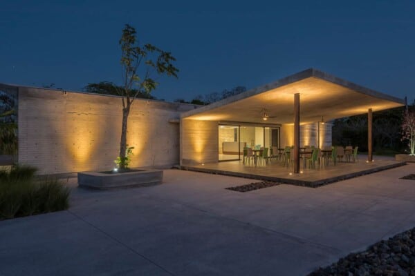
2 courtyards face the north and distribute breeze and sunlight into the essentially 1 room deep plan.
All finishes are economical. The house is constructed by a project builder and utilises project home technology in unique ways to achieve a tight budget.”
Photos by: Scott Burrows


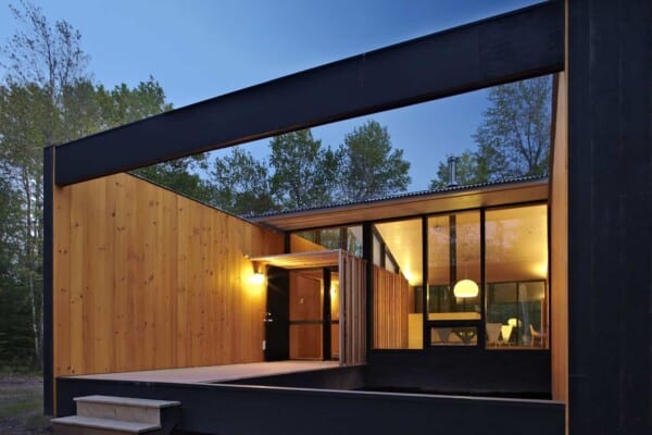









great how that weird smiley facade cuts right across the steps so you are the beacon for all rain, not. and i am not sure why the kitchen had to be so narrow. it looks like a hallway. that weird hallway with stairs looks uncomfortable as well. should have been a glass staircase, that would take less width, and give more illusion of space. a more uncomfortable house i find difficult to foresee.