Located on a stunning country road, in a “ribbon” of houses in Everdingen, The Netherlands, creative designers at Walden Studio have recently completed a beautifully modern rustic addition called the House Extension Along the Dike, intended to give a young family a little more space and better views of the beautiful pastures behind their home.

Near Utrecht is a beautiful river called the Lekt. It is on the banks of this river that a stunning old house was originally built along a row of others in 1910. Now, however, the house is owned by a young and still-growing family who needs a little more space than the house had to offer.
The house is situated outside of the winter dikes, meaning that is only safeguarded on its sides by a lower summer dike. These water variances, of course, influenced and determined certain choices in the building of the original home, as well as in how the new extension might be built.

The first houses built in the area measured a modest 70 square metres, making them a perfectly comfortable home for two. When the new owners’ family began expanding beyond two, however, they realized that they’d fallen too far in love with the stunning floodplains around their house, as well as the gorgeously friendly atmosphere to leave.

That’s why they decided to stay and simply adapt their little house to accommodate their new clan! They wished to do so, however, in away that would respect the integrity and history of the original house, rather than interfering with or overpowering it.

From the outset, the owners wished to expand two rooms and also add two. They wished to increase the size of their already existing dining room as well as their living room. Besides that, they also wished to add an extra bedroom and bathroom on the first floor of the little house.
Because of the beautiful natural land that the house sits on and next to, there were several environmental limitations that the designers and construction teams had to work with. For example, the maximum possible width that the extension could possibly be was only four metres because a very important natural reserve exists just past the home’s borders and respecting that was crucial.

On top of that, designers also wanted to leave “flood space”, or a slight border of land around the house between the solid land and the marshy areas around the dikes below the house in order to protect the house from flooding. This space acts as a buffer between the potential rising waters and the foundation of the house. Accounting for this space determined a very small available area in which to create the addition.

Although this little house sits in a “ribbon” of homes that are arranged along the main road like a strip, there are several openings between the houses that were intentional in their original conception. Even decades ago, architects valued the scenery around the neighbourhood so much that they knew it was integral to keep the houses from pressing up against one another in order to give the inhabitants of each one the space to take advantage of their beautiful setting.
The designers of this new extension took inspiration from the setup of this row of houses and opted to include open spaces that show off the view within the house itself. This accounts for the inclusion of large glass windows and sliding glass doors. The intent here is to provide a seamless feeling experience between the bright, cheerful feeling inside and the stunning outdoors, which the owners wanted to let their young children enjoy whenever possible.

Another unique element of this extension that sets it apart ever so slightly without interrupting the rest of the neighbourhood’s visual aesthetic is the fact that it was built on columns. This makes the extension look as though it is floating above the dike slightly, which the designers hoped would add a sense of extra suspense to the overall visual.

Putting the extension on columns also created a lovely sheltered area underneath. This provides a small patio like space where the family can enjoy an outdoor area with some cool shade and protection fro, the sun. At the same time, the jaunty asymmetrical gable roof stretches towards the sky and accentuates the view of the stunning floodplains.

The roof is actually more than just an angular structure meant for modern style. In reality, designers included it as a nod to the shape of historical barns of the local region, re-incorporating a bit of rustic charm that makes even more sense in the immediate context and environment,
In the interest of preserving as much of the original house as possible in its first form, since it was good and whole outside of the need for more space, designers used the existing stairwell as a base for anchoring it to the side of the home. At the top, they added a skylight that helps keep this previously slightly dark space bright and cheerful, making things feel even more open.

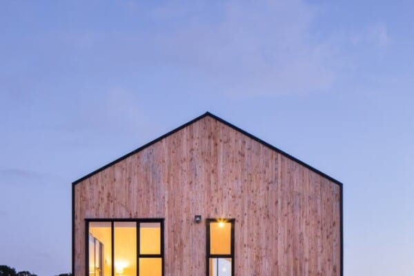
On the outside of the house, you’ll notice a charmingly dark facade that suits the environment rather than making the structure appear too dark. This is black pine wood that actually did come from the old barns in the region that we mentioned before. These reclaimed pieces get their colour from tar that is applied to protect the wood and increase its durability against weathering.

The reclaimed wood isn’t the only sustainably sourced material that went into the building of this extension. Pieces of the wooden frame and the steel columns and beams of the “table” it was placed upon to make the shady overhang are also locally reclaimed. Inside the walls, renewable materials like flax insulation and accoya wood window frames have been used. On the underside of the extension, where a roof over the patio has been created, naturally stained Douglas-fir planks make things feel durable and cozy at once.
Inside, the spaces within the extension vary ever so slightly from the rest of the original house. The older spaces are slightly more historically inspired in their details and furnishings, while the new rooms are cleanly detailed and a little more fresh and minimalist looking. They are styled with a materiality that suits the rest of the house for cohesiveness, but designers didn’t hide the refreshed, updated nature of the spaces. Instead, they let them shine, seeking beauty in the contrast and how the space marks the lovely little village as one that’s still ideal for raising families in decades after the neighbourhood was built.
Photos provided by the architects.


