In the heart of Melbourne, Australia, innovative designers at Siren Design have recently completed an entire office wide renovation on the newly improved and wonderfully contemporary Maximus Offices!

From the outset, the goal of this renovation was to improve the sense of space for employees. Company heads wanted their business management consultancy team to feel a sense of individuality even while the office itself bears several similarities with the Sydney location, for the sake of cohesiveness and brand consistency.

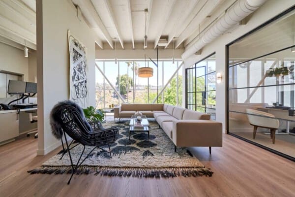
The first decision designers made was to open up the space completely, both in terms of its layout and in terms of its own framework. Now, the floor plan of each room is open concept and the “bones” of the building, in its supports, ceiling, frame, and details are visible in a way that, rather than looking unfinished, looks minimalist and modern industrial chic.

Another update that had perhaps the biggest effect on employee moods and productivity was the decision to open up as much of each room as possible to ensure that just about every corner is flooded with natural sunlight. This contrast well with the raw elements of the redone building even as it lifts the spirits of those working in the offie and creates and inviting atmosphere typical of more modern office spaces in wider Melbourne.

Another priority shift in the office’s redesign was the way designers opted to explore a sort of blurring of space and traditional boundaries between work spaces, break rooms, and the parts of an office that visitors would normally see. By amalgamating some of these things in one place, keeping designated areas but not closing them off, designers and company heads aimed to make the space more collaborative, friendly in its professionalism, diverse, and welcoming in the way the space works and flows. There’s also a touch of novelty here; now, visitors see some consultants at work to some degree, giving them a sort of “behind the scenes” sneak peek.

Overall, the whole environment was created to feel relaxed. In the entryway, guests are immediately encountered with a welcoming space that, though separate for employee concentration, gives people an easy view into some of the collaborative workspaces. This immediate connection is great for outside collaboration as well as creativity.


Increasing the option of collaborative spaces for the employees themselves was a huge priority as well. The first way in which the company decided to work towards this was by designing a shared cafe, situated near the entrance where guests might join. This space is also often used as a training zone for new employees, making it one of the most diversely used spaces in the whole office.


Now, as we mentioned, the Melbourne space is cohesive with the branding and style of the Sydney location, but it still has its own charm and individualized style, as influenced by its particular employees. Though company values and colour schemes are consistent between the two cities, the new Melbourne spot has a slightly more relaxed, almost residential feel. Where Sydney is rather sophisticated, Melbourne is built to make people feel a little bit more at home.
Photos by Cheyne Toomey


