In the historical city of Tel Aviv-Yafo, Israel, the fresh and modern A5 House was recently completed by Raz Melamed Architects as part of an ongoing project to refurbish older buildings in the area for easier modern living without disturbing their outwards historical context.

In reality, the A5 House is a modest but still impressive 70 square metre studip apartment that has been redesigned into a modern getaway. It lies at the centre of Tel Aviv’s historic Neve Tzedek neighbourhood, which is part of the reason it was chosen for this refurbishment project. Despite the fact that designers on the project had previous experience with authentically and respectfully redoing historical buildings, this particular spot presented a unique set of challenges.
Previously to being redone, this property as derelict and abandoned for many years. When designers arrived on scene, they found what looked like a collection of ramshackle shacks, all hacked together in a way that appears shoddy and unreliable. The effect of this construction was to make an inner space that appear like a sort of dark, disjointed maze with only a hidden back patio for private outdoor space.

Additionally, a slanted wall that divided the main inner spaces presented something to think about and work with or around. In short, the space needed thorough renovation. Within that, however, it was essential that contractors remain diligent and careful, since they were, in fact, working in an historical space. The team aimed to work carefully enough to protect the building’s outer shell and preserve the home’s historical integrity.

In the early planning stages, designers came up with three distinct potential layouts that might work within the unique space. Each of these accounted for the sharply slanted wall in different ways; one tried to hide the wall to create an illusion of wide open rectangular space, a second worked it into the plan in a way that was subtle, and the third made is a central part of the layout, relying on it quite heavily.

In the end, designers went with the first plan, option for openness and free flowing space with as little slanted interruption as possible. They did this by taking advantage of both horizontal and vertical space, eventually dividing the apartment’s interior into four distinct spaces, each one rectangular in shape.

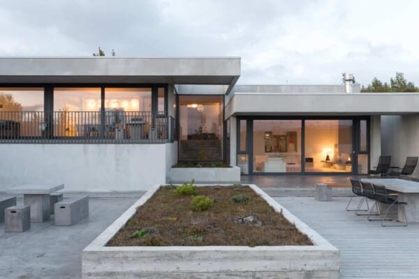
Now, the spaces are organized into a sleeping area, a living room, and kitchen, and a stunning outdoor patio. Each of these are divided by beautifully intersection vitrine windows that open from room to room or onto the patio using a Belgian style pivot door. The patio is accessible from both the living room and the bedroom, while the bedroom is separated from the two inner social spaces by an additional wall of windows.

The use of only glass walls within the apartment itself and surrounding the patio has a practical function as well as a decorative one. This way, natural light is permitted to flow freely into the rooms, reaching just about every corner. The same goes for fresh air when the windows are pivoted open. The stone wall surrounding the patio, however, keeps the inner space nice and private despite the clear line of sight from the patio inward.

In order to keep the flow of space and open concept construction of the inside rooms even and symmetrical, designers opted to hide the apartment’s bathroom behind a subtle door in the kitchen. This stops the apartment from having an uneven visual space and makes it feel like a standard modern one-bedroom, despite its old fashioned courtyard and lovely historical outer aesthetic.

On the more public side of the house, which faces the street, designers opted to glad windows with wooden shutters that are more standard of the buildings in the area. This gives the inner spaces privacy without interrupting the visual aesthetic of the local area. The effect is that the modern appearance of the apartment inside and the way it contrasts with the exterior is sort of a surprise for visitors entering for the first time.

The clean, simple layout plans might make the apartment look like it was easy to manifest, but that’s not so. First, designers had to essentially rebuild and replace the original infrastructure due to rotting beams near the roof. The original flooring, worn and unsuitable after years of both use and neglect, also needed redoing.

Each of these radical project aspects, of course, had to be completed within the parameters set out by local preservation authorities. Designers could not, for example, change the height of the building. Any changes or updates that were made to the outside fo the home were done using locally sourced supplies that would have been authentic to the area in any era.

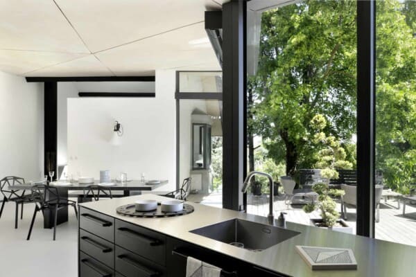
This sense of natural, raw materiality continues on the inside of the apartment as well. A calming grey colour palette was chosen as a happy medium between old fashioned and minimalist, modern aesthetics. The bathroom features grey tiles while the kitchen and bedroom boast impressive woodworked details that have been painted a matching grey.
In contrast, the kitchen island, granite countertops, and steelwork around the pivoting glass doors were all done in black in order to ground the space and create periodic focal points. Greenery in the serene, old fashioned patio completes the space, bringing that sense of a natural escape home.
Photos by Amit Geron