In the city centre of Buenos Aires, Argentina, innovative design teams at KLM Arquitectos have recently renovated the publishing house IMQ Editorial, giving it a modernized feel much more suited to its urban location and diverse neighbourhood.

Though wildly successful, this publishing house is small and specialized. It primarily publishes kids’ books that have some kind of scientific content! The functional needs of the company are quite simple, which worked well with the slight limitations of small urban office spaces typical to the area. Besides a reception area and some small offices, the company also needed a reading area, a kitchen, some meeting rooms, and an accessible terrace for staff and industry client use.

The update for the publishing house was a long time coming but was perfectly timed, as the mixed-use neighbourhood it currently sits in has hit a period of transformation and change. The streets surrounding it are home to light industrial warehouses, diverse housing types, commercial spaces, and even some mechanical repair shops.

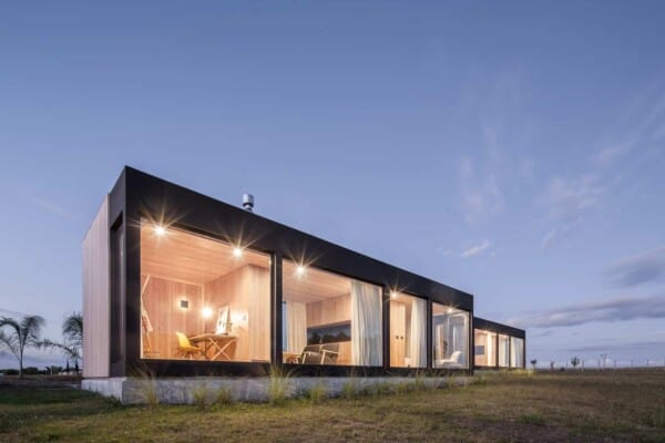
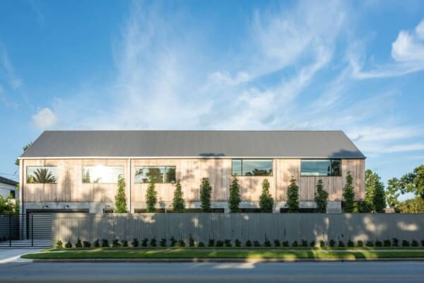
On the exterior, the building is a concrete cube that has been hollowed out to provide the publishing space on the inside. Rather than looking cold, however, the light concrete picks up the sun and looks stylishly industrial. It stands quite high, which designers took full advantage of on the inside, organizing offices and workspaces between three separate floors.

To keep things bright and feeling airy, an empty column of space extends up the centre of the entire building, with the offices placed around it like a border on each floor. This space spans from the ground floor all the way up to the ceiling, with a staircase winding upwards in the same fashion from floor to floor as well. The cubic shape you see on the outside is preserved here.

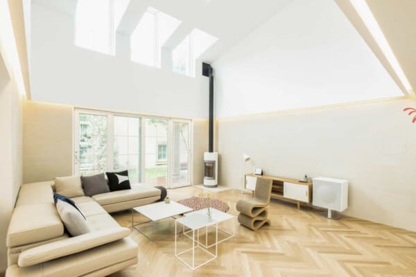
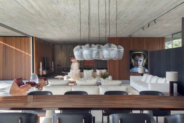
On the inside, the decor scheme doesn’t have much relationship with the streetscape outside its walls. That’s okay, though, because the effect is a transformational one! Rather than seeing urban textures and styles reflected in the interiors, you experience a shift into light woods, white surfaces, shining glass, and natural light bathing all of it thoroughly. The effect is comforting and quite playful, particularly in contrast to the slightly more stern exterior facade.

The very materiality of the interior decor scheme creates contrast with the bustling city outside the building’s doors as well! Nearly all materials you’ll find inside are very natural (and were even sourced and reclaimed locally), so the atmosphere inside contrasts well with the industrial street life just a few feet away on the sidewalk.
Photos by Javier Agustin Rojas